Tag: human-centered design

  • Seeing What Is Not Always Visible

    Color Accessibility and Thoughtful Design for a Shared World
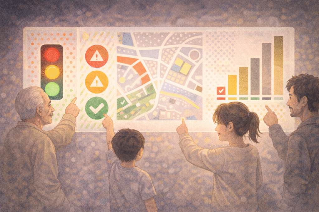
    Is it red or green?

    On maps, blue means water.
    Red signals danger.
    Green tells us everything is fine.

    But what if those colors are not clearly distinguishable?

    For millions of people worldwide, information conveyed only through color is not intuitive—it is confusing. Around 8% of men and 0.5% of women globally experience some form of color vision deficiency. For them, a traffic light, a chart, or a digital interface designed without consideration can turn everyday navigation into uncertainty.

    This is not a marginal issue of perception.
    It is a question of access.

    Color-based information causing confusion for a user with color vision deficiency

    1. Not Color-Blind, but Color-Different

    1.1 What color vision deficiency really means

    The term “color blindness” often suggests an inability to see color at all. In reality, most people with color vision deficiency do perceive color—but differently.

    The most common type is red–green color deficiency, where reds and greens may appear muted, brownish, or indistinguishable. Blue–yellow deficiencies and complete achromatopsia (seeing only in grayscale) exist but are far rarer.

    Color vision deficiency is not an absence of sight.
    It is a difference in interpretation.

    1.2 Why this difference matters

    Because color plays a central role in modern communication, this perceptual difference directly affects safety, comprehension, and autonomy. When critical information relies on color alone, accessibility silently collapses.


    2. The Risk of Color-Only Communication

    2.1 Everyday designs that exclude

    Many environments still depend solely on color to convey meaning:

    • Transit maps that distinguish routes only by color
    • Charts where increases and decreases are color-coded without labels
    • Game interfaces where health status changes only from green to red
    • Medical dashboards that rely on color intensity to signal urgency

    For users with color vision deficiency, these designs slow recognition—or render information unreadable.

    2.2 When accessibility becomes a safety issue

    In transportation, healthcare, emergency systems, and public infrastructure, color-exclusive design is not merely inconvenient. It can be dangerous.

    Accessibility is not about aesthetics.
    It is about reliability under diverse conditions.


    Different color perception showing how the same information can be interpreted differently

    3. Universal Design Looks Beyond Color

    3.1 What universal design means

    Universal design aims to create environments usable by as many people as possible, regardless of age, ability, or sensory differences.

    In color usage, this means refusing to treat color as a single channel of meaning.

    3.2 Practical principles of accessible color design

    Effective color-inclusive design often includes:

    • Redundant cues: combining color with icons, patterns, text, or position
    • High contrast between foreground and background
    • Pattern overlays or shape distinctions in charts and maps
    • Testing designs with color-vision simulation tools

    These approaches do not dilute design quality.
    They strengthen clarity for everyone.


    4. How Global Companies Responded

    4.1 Google Calendar

    Originally dependent on color alone, Google Calendar introduced icons and layout cues after accessibility feedback, improving usability across perceptual differences.

    4.2 X (formerly Twitter)

    Beyond color changes, interaction feedback now includes motion and haptic responses, ensuring meaning is conveyed through more than visual color shifts.

    4.3 UNO (ColorADD Edition)

    The classic card game introduced patterned symbols for each color, allowing color-deficient players to participate without disadvantage—an elegant example of inclusive play.

    Thoughtful design does not restrict creativity.
    It signals responsibility.


    5. Using Color Better, Not Less

    5.1 Accessibility is not color avoidance

    Color-inclusive design is not about eliminating color.
    It is about using color intelligently.

    When color works alongside structure, contrast, and context, information becomes clearer—not flatter.

    5.2 Color as a relational language

    Color is more than a visual signal.
    It is a way of inviting others into shared understanding.

    Designing with accessibility in mind means noticing what others might miss—and choosing not to leave them behind.

    Inclusive design using color, icons, and patterns to ensure accessibility for all users

    Related Reading

    The act of noticing what escapes attention connects to cognitive framing discussed in How Search Boxes Shape the Way We Think.

    This sensitivity to the unseen also mirrors existential concerns explored in Solitude in the Digital Age: Recovery or a Deeper Loss?.

    Conclusion: A World Designed to Be Seen Together

    Color does not appear the same to everyone.
    But meaning should remain reachable.

    Color accessibility is not a technical constraint.
    It is an ethical orientation.

    With small adjustments—patterns, contrast, redundancy—we can design systems that are not only beautiful, but fair.

    A world truly designed for humans is one where no one is excluded by how they see.


    References

    1. Ware, C. (2008). Visual Thinking for Design. Morgan Kaufmann.
      This work explores how humans perceive visual information, explaining why reliance on color alone often fails. Ware emphasizes contrast, spatial positioning, and pattern as critical tools for accessible visual communication.
    2. Norman, D. A. (2013). The Design of Everyday Things (Revised Edition). Basic Books.
      A foundational text in human-centered design, arguing that good design should be understandable without explanation. Norman’s principles strongly support accessibility as a core design responsibility.
    3. Lidwell, W., Holden, K., & Butler, J. (2010). Universal Principles of Design. Rockport Publishers.
      This reference outlines key design principles such as redundancy, affordance, and accessibility, offering practical guidance for inclusive design across sensory differences, including color vision deficiency.
  • Digital Aging: When Technology Moves Faster Than We Do

    “Where do I click?”
    “Can you show me again? Everything changed after the update.”
    “Is this a DM or a message?”

    Most of us have said—or heard—something like this at least once.

    Technology keeps accelerating, yet many of us experience a quiet, unsettling feeling:
    even without standing still, we somehow fall behind.

    That moment is often described as digital aging.

    A person hesitating in front of a complex digital interface, symbolizing digital aging

    1. What Is Digital Aging?

    Digital aging refers to the growing difficulty people experience as technology evolves faster than their ability—or willingness—to adapt.

    This is not simply about chronological age.
    It includes:

    • Feeling disoriented when interfaces change overnight
    • Knowing a feature exists but lacking the energy to relearn it
    • Feeling exhausted by constant updates rather than curious about them
    • Interpreting difficulty as personal failure instead of design overload

    Digital aging is less about incapacity and more about cognitive fatigue caused by relentless change.

    Importantly, this phenomenon affects all age groups.
    Many people in their twenties already describe themselves as “falling behind” certain platforms.


    2. Why Does Technology Evolve Without Waiting for Us?

    Technology claims to aim for convenience and efficiency.
    In practice, however, innovation often prioritizes novelty over familiarity.

    Common patterns include:

    • Menus relocating after updates
    • Essential settings buried deeper in interfaces
    • Gestures replacing buttons
    • Voice commands replacing visual cues

    Most digital systems are designed with speed-oriented, highly adaptable users in mind.
    As a result, those who value stability or need more time are unintentionally excluded.

    The message becomes subtle but clear:
    This system was not designed for you.

    Technology advancing faster than people, showing the growing digital gap

    3. How Technology Creates New Generational Divides

    Today, generational gaps are shaped less by age and more by technological fluency.

    • Some grew up before the internet
    • Some adapted during its expansion
    • Others have never known a world without smartphones

    Even within the same age group, digital confidence can vary dramatically depending on professional exposure, learning opportunities, and cultural context.

    Technology no longer just reflects generational difference—it produces it.


    4. From Discomfort to Digital Exclusion

    Digital aging becomes socially significant when it leads to exclusion.

    Examples include:

    • Older adults unable to use self-service kiosks
    • People missing invitations because communication moved to unfamiliar platforms
    • Students falling behind due to unfamiliar digital tools
    • Workers struggling with AI-driven systems introduced without support

    Over time, repeated difficulty can erode confidence and create avoidance.

    The psychological barrier often becomes stronger than the technical one.

    Inclusive digital design allowing people of all ages to use technology comfortably

    5. Can Technology Slow Down for Humans?

    There is growing recognition of the need for digital inclusion.

    Encouraging developments include:

    • Simplified device modes
    • Accessibility-focused design standards
    • Larger text and clearer interfaces
    • Digital literacy programs for all ages

    True inclusion, however, requires more than features.
    It requires design that respects human pacing, not just technological capability.

    Progress should not mean leaving people behind.


    Related Reading

    The sense of temporal mismatch between humans and systems is explored philosophically in If AI Can Predict Human Desire, Is Free Will an Illusion?.

    Practical effects of accelerated systems on daily judgment are also examined in Algorithmic Bias: How Recommendation Systems Narrow Our Worldview.

    Conclusion: Falling Behind Is a Shared Experience

    Digital aging is not a personal weakness.
    It is a structural consequence of rapid innovation without sufficient care.

    Everyone experiences moments of falling behind.

    The question is not whether technology advances—but whether it advances with people, not past them.

    You do not need to master every new tool.
    What matters is preserving curiosity without shame and designing systems that value humans as much as efficiency.

    Digital society becomes more humane when it moves at a pace people can actually live with.

    Related Reading

    The exhaustion that follows moral expectation connects to broader reflections on social pressure discussed in The Praise-Driven Society: Recognition and Self-Worth in the Digital Age.

    Similar emotional dynamics in daily life are also explored in How Social Media Amplifies Feelings of Lack and Comparison.

    References

    1. Selwyn, N. (2004). Adult Learning in the Digital Age: Information Technology and the Learning Society. London: Routledge.
    This book examines how adults engage with rapidly evolving digital technologies and highlights structural inequalities in access, skills, and confidence. Selwyn emphasizes that difficulties with technology are not individual failures but socially produced gaps shaped by design, education, and policy. It provides a foundational framework for understanding digital aging beyond chronological age.

    2. Prensky, M. (2001). Digital Natives, Digital Immigrants. On the Horizon, 9(5).
    Prensky introduces the influential distinction between “digital natives” and “digital immigrants,” arguing that generational exposure to technology shapes thinking patterns and learning styles. While widely cited, this work is best read as a starting point for debates on digital generational gaps rather than a definitive explanation.

    3. Bennett, S., Maton, K., & Kervin, L. (2008). The ‘Digital Natives’ Debate: A Critical Review of the Evidence. British Journal of Educational Technology, 39(5), 775–786.
    This critical review challenges the oversimplified native–immigrant divide, showing that digital competence varies widely within age groups. The authors argue that social, educational, and cultural factors matter more than age alone, offering an important corrective perspective for discussions of digital aging and inclusion.