Tag: design ethics

  • Uncomfortable by Design: How Spaces Are Built to Exclude

    Have you ever noticed that not all benches are really meant to be used?

    In many cities, public benches look inviting at first glance. But a closer look reveals metal bars dividing the seats, tilted surfaces, or cold materials that discourage anyone from staying too long. These designs seem subtle, almost invisible — yet they send a clear message.

    Uncomfortable design is not always a mistake.
    Sometimes, it is a deliberate choice.


    1. Metal Bars on Benches: “Don’t Lie Down”

    Hostile bench design discouraging rest in public space

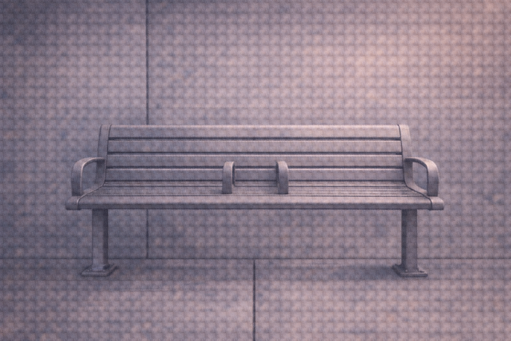
    1.1 Designed to Prevent Rest

    In parks, subway platforms, and public squares, benches are often fitted with metal dividers. Sitting is allowed, but lying down — or resting for more than a moment — becomes impossible.

    This design does not stop people from using the bench.
    It controls how they use it.

    1.2 Anti-Homeless Architecture

    These features are commonly referred to as anti-homeless or hostile architecture. Their purpose is not comfort, but regulation.

    Similar examples include:

    • Cold metal seats in public restrooms
    • Waiting areas without backrests
    • Slanted walls or narrow ledges

    Each silently communicates the same rule:
    You may stay briefly, but you are not welcome to remain.


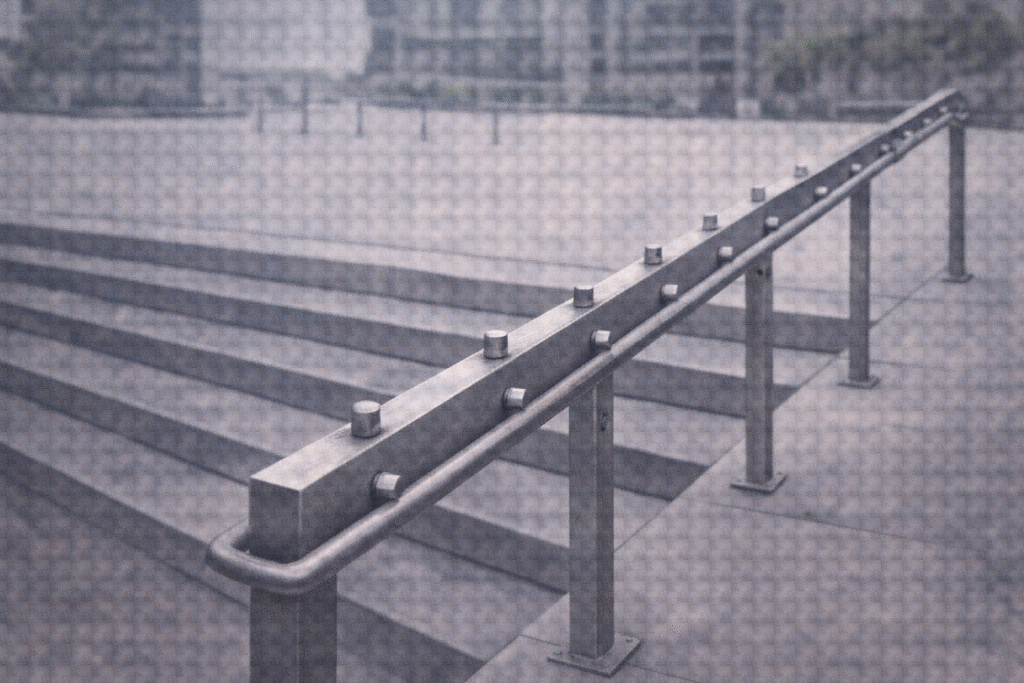
    2. Skateboard Deterrents on Stairs

    2.1 Controlling Youth Through Design

    Small metal studs embedded into stair rails or ledges prevent skateboarders from performing tricks. Officially, these devices protect public property and improve safety.

    However, critics argue that they also serve another function:
    the exclusion of youth culture from public space.

    Urban design elements controlling behavior in public space

    2.2 When Play Becomes a Problem

    By treating play as disruption, design becomes a tool of social control. What appears to be a technical solution reflects a deeper cultural judgment about who belongs in public space — and how they should behave.


    3. Heavy Doors and Narrow Handles: The Opposite of Universal Design

    3.1 Who Can Enter — and Who Cannot

    Some buildings have heavy doors, high or narrow handles, and awkward entrances. These features create real barriers for:

    • Wheelchair users
    • Parents with strollers
    • Elderly people
    • Children

    Access becomes a privilege rather than a right.

    3.2 Exclusion by “Normal” Standards

    Such designs often reflect two assumptions:

    1. A default user without physical limitations
    2. A lack of concern — or intentional disregard — for others

    In this sense, uncomfortable design operates as the opposite of universal design: it works smoothly for some, while quietly excluding others.


    4. Discomfort Is Not Accidental

    4.1 Design as Power

    Across these examples, a clear pattern emerges: discomfort is rarely random. It is frequently intentional — and often political.

    Design is not just about aesthetics or efficiency.
    It shapes behavior.

    4.2 Silent Messages in Space

    Through design, spaces communicate:

    • Who is visible
    • Who is welcome
    • Who should move along

    This subtle form of exclusion functions as a kind of silent violence — unnoticed by many, but deeply felt by those affected.


    5. Is Inclusive Design Possible?

    Inclusive public space designed for diverse users

    5.1 Designing for Everyone

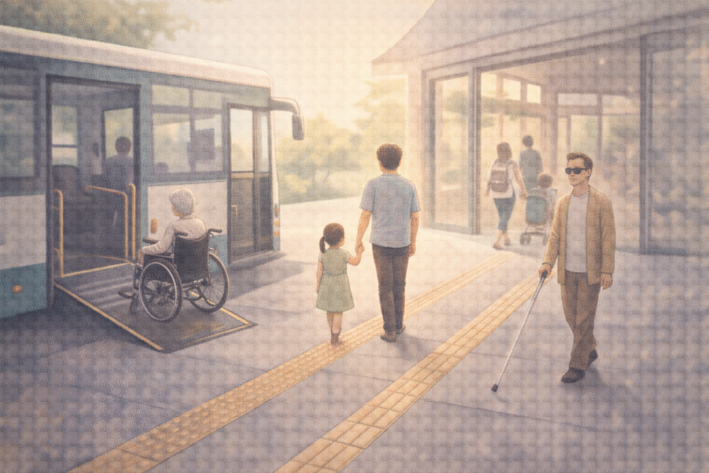
    Yes — and it already exists. Universal design starts from the idea that public spaces should accommodate as many people as possible.

    Examples include:

    • Low-floor buses accessible to wheelchairs
    • Braille signage for visually impaired users
    • Adjustable public sinks
    • Elevator buttons designed for all heights

    These designs demonstrate that inclusion is not only ethical — it is practical.

    5.2 Design as Invitation

    Design can push people away, or it can invite them in. Recognizing the intentions hidden in everyday spaces is the first step toward building environments based on care rather than control.


    Closing Thoughts

    Design does not speak — but it communicates powerfully.

    Uncomfortable design often serves to silence the vulnerable and regulate the unwanted. That is why we must question even the most ordinary features of our surroundings.

    Who is this space really for?

    Asking that question may be the beginning of a truly comfortable world.

    Related Reading

    Systemic patterns that standardize experience and marginalize difference are examined in The Standardization of Experience.

    Philosophical perspectives on hierarchy and exclusion appear in Civilization and the “Savage Mind”: Relative Difference or Absolute Hierarchy?


    References

    1.Selwyn, N. (2013). Distrusting Educational Technology: Critical Questions for Changing Times. London: Routledge.
    This book critically examines how technology and design are never neutral, highlighting how systems and spaces can reinforce inequality, exclusion, and surveillance, particularly in public and educational environments.

    2.Smith, R. (2020). Hostile Architecture: Design Against the Homeless. Santa Barbara: Punctum Books.
    A comprehensive analysis of hostile architecture worldwide, documenting how urban design is used to exclude homeless people, youth, and other marginalized groups, and connecting these practices to broader urban politics and ethics.

    3.Norman, D. A. (2013). The Design of Everyday Things (Revised and Expanded Edition). New York: Basic Books.
    A foundational work in design psychology that emphasizes user-centered design, illustrating how thoughtful design can empower users — and how exclusionary design fails them.

  • Seeing What Is Not Always Visible

    Color Accessibility and Thoughtful Design for a Shared World

    Is it red or green?

    On maps, blue means water.
    Red signals danger.
    Green tells us everything is fine.

    But what if those colors are not clearly distinguishable?

    For millions of people worldwide, information conveyed only through color is not intuitive—it is confusing. Around 8% of men and 0.5% of women globally experience some form of color vision deficiency. For them, a traffic light, a chart, or a digital interface designed without consideration can turn everyday navigation into uncertainty.

    This is not a marginal issue of perception.
    It is a question of access.

    Color-based information causing confusion for a user with color vision deficiency

    1. Not Color-Blind, but Color-Different

    1.1 What color vision deficiency really means

    The term “color blindness” often suggests an inability to see color at all. In reality, most people with color vision deficiency do perceive color—but differently.

    The most common type is red–green color deficiency, where reds and greens may appear muted, brownish, or indistinguishable. Blue–yellow deficiencies and complete achromatopsia (seeing only in grayscale) exist but are far rarer.

    Color vision deficiency is not an absence of sight.
    It is a difference in interpretation.

    1.2 Why this difference matters

    Because color plays a central role in modern communication, this perceptual difference directly affects safety, comprehension, and autonomy. When critical information relies on color alone, accessibility silently collapses.


    2. The Risk of Color-Only Communication

    2.1 Everyday designs that exclude

    Many environments still depend solely on color to convey meaning:

    • Transit maps that distinguish routes only by color
    • Charts where increases and decreases are color-coded without labels
    • Game interfaces where health status changes only from green to red
    • Medical dashboards that rely on color intensity to signal urgency

    For users with color vision deficiency, these designs slow recognition—or render information unreadable.

    2.2 When accessibility becomes a safety issue

    In transportation, healthcare, emergency systems, and public infrastructure, color-exclusive design is not merely inconvenient. It can be dangerous.

    Accessibility is not about aesthetics.
    It is about reliability under diverse conditions.


    Different color perception showing how the same information can be interpreted differently

    3. Universal Design Looks Beyond Color

    3.1 What universal design means

    Universal design aims to create environments usable by as many people as possible, regardless of age, ability, or sensory differences.

    In color usage, this means refusing to treat color as a single channel of meaning.

    3.2 Practical principles of accessible color design

    Effective color-inclusive design often includes:

    • Redundant cues: combining color with icons, patterns, text, or position
    • High contrast between foreground and background
    • Pattern overlays or shape distinctions in charts and maps
    • Testing designs with color-vision simulation tools

    These approaches do not dilute design quality.
    They strengthen clarity for everyone.


    4. How Global Companies Responded

    4.1 Google Calendar

    Originally dependent on color alone, Google Calendar introduced icons and layout cues after accessibility feedback, improving usability across perceptual differences.

    4.2 X (formerly Twitter)

    Beyond color changes, interaction feedback now includes motion and haptic responses, ensuring meaning is conveyed through more than visual color shifts.

    4.3 UNO (ColorADD Edition)

    The classic card game introduced patterned symbols for each color, allowing color-deficient players to participate without disadvantage—an elegant example of inclusive play.

    Thoughtful design does not restrict creativity.
    It signals responsibility.


    5. Using Color Better, Not Less

    5.1 Accessibility is not color avoidance

    Color-inclusive design is not about eliminating color.
    It is about using color intelligently.

    When color works alongside structure, contrast, and context, information becomes clearer—not flatter.

    5.2 Color as a relational language

    Color is more than a visual signal.
    It is a way of inviting others into shared understanding.

    Designing with accessibility in mind means noticing what others might miss—and choosing not to leave them behind.

    Inclusive design using color, icons, and patterns to ensure accessibility for all users

    Related Reading

    The act of noticing what escapes attention connects to cognitive framing discussed in How Search Boxes Shape the Way We Think.

    This sensitivity to the unseen also mirrors existential concerns explored in Solitude in the Digital Age: Recovery or a Deeper Loss?.

    Conclusion: A World Designed to Be Seen Together

    Color does not appear the same to everyone.
    But meaning should remain reachable.

    Color accessibility is not a technical constraint.
    It is an ethical orientation.

    With small adjustments—patterns, contrast, redundancy—we can design systems that are not only beautiful, but fair.

    A world truly designed for humans is one where no one is excluded by how they see.


    References

    1. Ware, C. (2008). Visual Thinking for Design. Morgan Kaufmann.
      This work explores how humans perceive visual information, explaining why reliance on color alone often fails. Ware emphasizes contrast, spatial positioning, and pattern as critical tools for accessible visual communication.
    2. Norman, D. A. (2013). The Design of Everyday Things (Revised Edition). Basic Books.
      A foundational text in human-centered design, arguing that good design should be understandable without explanation. Norman’s principles strongly support accessibility as a core design responsibility.
    3. Lidwell, W., Holden, K., & Butler, J. (2010). Universal Principles of Design. Rockport Publishers.
      This reference outlines key design principles such as redundancy, affordance, and accessibility, offering practical guidance for inclusive design across sensory differences, including color vision deficiency.